Standing out from the Crowd
We were tasked to create a visually impactful, modern brand for a PanAfrican Probiotic company. With a clean and contemporary logo design and an impactful, relatable packaging, this brand can truly stand out in a very competitive probiotic market in South Africa.
Client
Ogilvy // Oros
Year
2019
Services
Design // Augmented Reality
Client
Velobiotics // IDC
Year
2020
Services
Brand Strategy // Marketing Strategy // Brand Development // Packaging Design
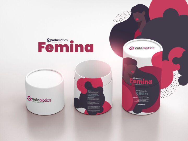
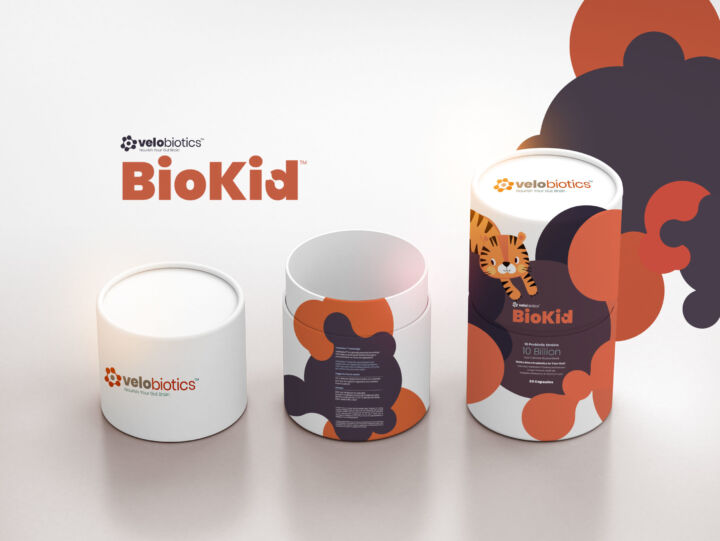
Building the Brand
Our brand strategy focused on an iconic mark, representing the 4th Industrial Revolution in the context of Africa. The colour palette was bold, striking and used as a way to organise information across shared, owned and paid channels as well as sector verticals.
VeloGrey
BioBase
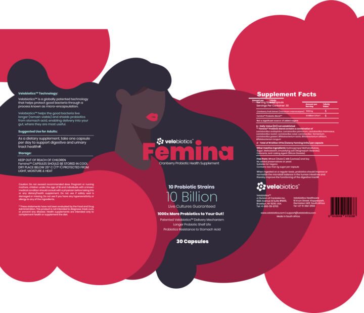
Femina Red
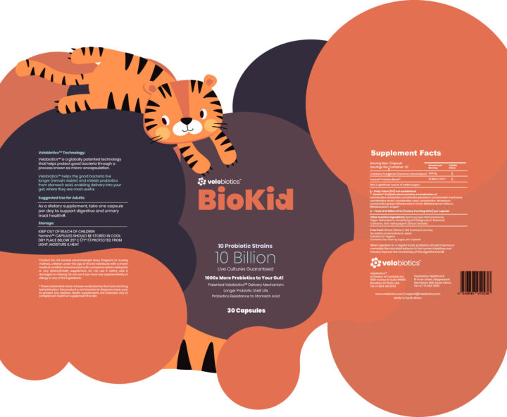
Bio Orange
Connecting with Colour
We understood our client’s projected product development plans and designed a visual system to future-proof the brand’s visual identity through the use of our design language and strong colour palettes that connect to the mother-brand.